In the yoga apparel market, customers rarely judge a brand by a single product. They experience the brand as a complete visual world: the logo on a waistband, the colors used across a collection, the fabric texture shown in campaign photography, the packaging received after purchase, and the consistency of every online and offline touchpoint. A cohesive visual identity system brings these elements together so that the brand feels recognizable, credible, and intentional.
For yoga apparel businesses, visual identity is especially important because the product must communicate both performance and lifestyle value. Customers expect leggings, sports bras, tops, and related activewear to support movement, but they also use these products to express personal taste and values. A strong identity system helps translate a brand’s positioning into a visual language that can guide product development, custom yoga wear manufacturing, packaging, marketing, and future collection planning.
This guide explains how to build a cohesive visual identity for a yoga apparel brand while keeping the system practical enough to support custom product development, OEM/ODM production, wholesale growth, and brand expansion.
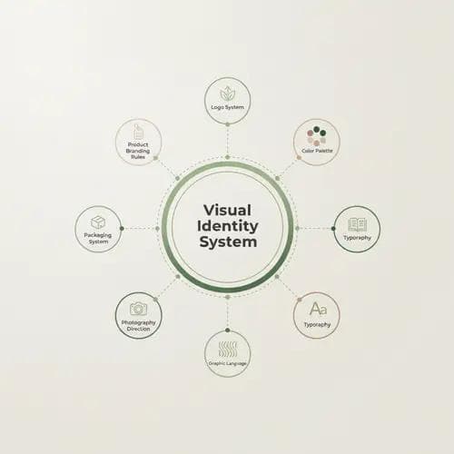
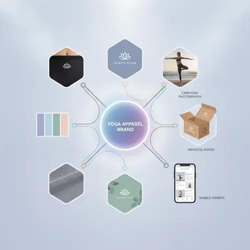
A visual identity system is the structured set of design elements and rules that determines how a brand looks across products, packaging, marketing materials, digital channels, and physical environments. It is broader than a logo. The system connects brand strategy with repeatable visual decisions.
For a yoga apparel brand, this system may include the logo, color palette, typography, graphic elements, garment branding, trims, labels, packaging, photography direction, and product presentation standards. Each component should reinforce the same brand position while remaining flexible enough to work across different collections and sales channels.
| Identity component | Role in a yoga apparel brand | Common product application ||---|---|---|| Logo system | Creates immediate recognition | Waistbands, chest prints, heat-transfer logos, labels || Color palette | Establishes mood and collection consistency | Fabrics, trims, packaging, digital campaigns || Typography | Shapes the tone of brand communication | Hangtags, care labels, lookbooks, websites || Graphic language | Adds distinctive visual character | Prints, jacquard patterns, packaging, social content || Photography direction | Defines how products and lifestyle are presented | Campaigns, catalogs, marketplaces, wholesale materials || Packaging system | Extends the brand experience after purchase | Poly bags, tissue paper, boxes, mailers, thank-you cards || Product branding rules | Ensures consistency across garment categories | Logo size, placement, label hierarchy, hardware finishes |
The goal is not to make every item look identical. The goal is to make every item feel as though it belongs to the same brand.
A cohesive yoga apparel visual identity begins with a clear brand strategy. Before selecting colors or designing a logo, define the market position the visual system must express.
Consider the customer you want to serve, the yoga or wellness lifestyle connected to the brand, the product price level, the main sales channels, and the reasons customers should choose your products. A studio-focused yoga label may need to communicate calm, comfort, and community. A performance-oriented activewear brand may emphasize technical construction, compression, and athletic confidence. A fashion-led yoga apparel line may rely on directional silhouettes, refined color stories, and premium detailing.
A useful positioning statement should clarify four points: who the brand serves, what it offers, why it is different, and how it should make customers feel. This foundation gives designers, manufacturers, photographers, marketers, and retail partners a shared direction.
A visual identity becomes cohesive when every design choice expresses the same strategic idea.
For B2B yoga apparel businesses, strategic clarity also improves communication with a custom clothing manufacturer. When the manufacturer understands the target customer, price positioning, and desired brand perception, it becomes easier to recommend suitable fabrics, logo techniques, trims, packaging options, and product construction.
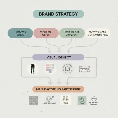
Brand personality turns positioning into human characteristics. It helps a yoga apparel brand decide whether it should appear understated or expressive, soft or powerful, natural or technical, accessible or exclusive.
Choose three to five personality traits that can guide visual decisions. A brand might be described as grounded, refined, supportive, and modern. Another might be energetic, bold, inclusive, and urban. These traits should be specific enough to influence design rather than functioning as generic marketing language.
The chosen personality can be translated into practical visual cues:
Consistency does not require the brand to remain visually static. A well-defined personality provides a stable core while allowing seasonal campaigns and collections to evolve.
A yoga apparel logo must work in more situations than a standard corporate logo. It may appear as a small heat-transfer mark on a sports bra, a silicone patch on a jacket, a woven label inside leggings, an embossed symbol on hardware, or a prominent graphic on packaging. A single logo format is rarely enough.
Develop a responsive logo system that includes a primary logo, a compact secondary lockup, a standalone symbol, and approved one-color versions. Establish minimum sizes, clear-space requirements, acceptable background colors, and rules for embroidery, screen printing, heat transfer, silicone, rubber, reflective applications, and other production techniques.
The physical limitations of apparel production should be considered early. Very thin lines, tiny lettering, complex gradients, and intricate details may not reproduce consistently at garment scale. Testing the logo through real sampling is more reliable than evaluating it only on a screen.
For custom yoga apparel, logo placement should also follow a recognizable hierarchy. A core placement area—such as the center-back waistband or left chest—can create consistency, while alternative placements can be reserved for capsules, collaborations, or limited collections. This approach protects brand recognition without restricting creative product design.
Color is one of the fastest ways to create recognition, but yoga apparel brands need more than a list of attractive shades. They need a color architecture that explains how colors should function across the master brand, core products, seasonal collections, packaging, and digital communication.
Begin with a small set of primary brand colors that can remain consistent over time. Add supporting neutrals and a controlled range of accent colors. Then define how seasonal apparel colors may expand without weakening the overall identity.
| Color layer | Purpose | Example use ||---|---|---|| Primary brand colors | Maintain long-term recognition | Logo, website interface, key packaging elements || Core neutrals | Create stability and commercial versatility | Black, white, taupe, charcoal, navy, cream || Accent colors | Add energy and differentiation | Campaign graphics, trims, selected product details || Seasonal colors | Refresh collections while following brand direction | Limited drops, coordinated sets, studio-to-street capsules || Technical colors | Support product function or category coding | Performance lines, fabric technology tags, fit categories |
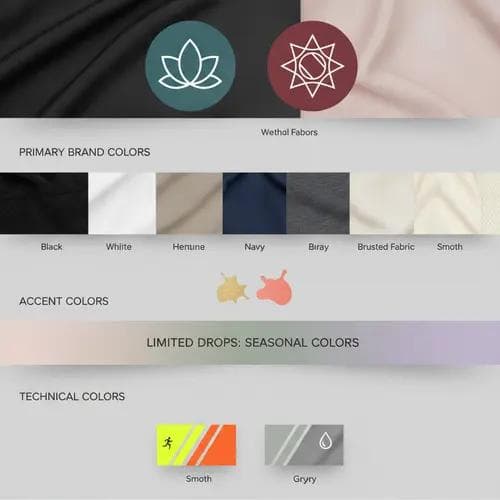
Fabric introduces variables that digital color systems do not fully capture. The same color can look different on brushed nylon, ribbed fabric, recycled polyester, cotton blends, or high-shine performance materials. Stretch, dye method, surface texture, and lighting can all affect perception. For this reason, color approval should include physical lab dips, fabric swatches, and samples rather than relying only on digital references.
A cohesive yoga apparel collection should also consider how colors coordinate across leggings, bras, tops, shorts, jackets, and accessories. Customers often shop for matching sets or mix-and-match combinations, so color planning can support both visual identity and commercial merchandising.
Typography influences how customers interpret a brand before they read the message itself. A clean geometric typeface may feel contemporary and performance-driven, while an elegant serif may create a more editorial or premium impression. Softer letterforms can convey approachability and wellness, whereas condensed or highly structured styles may communicate energy and precision.
Choose a primary typeface for headlines and a complementary typeface for body copy, product information, and technical content. The typography system must remain readable across packaging, hangtags, wholesale line sheets, care labels, size labels, mobile screens, and campaign graphics.
In apparel production, small-format legibility is critical. Care instructions, fiber content, sizing, and compliance information often need to fit within limited label space. The type selected for brand campaigns may not be suitable for technical labels, so the identity system should specify practical alternatives that still feel aligned.
A graphic language gives the brand visual assets beyond its logo. It may include line patterns, geometric shapes, botanical forms, movement-inspired curves, gradients, textures, icons, or custom illustrations. These elements can connect product design with marketing and packaging.
For yoga apparel, graphic elements can be applied through all-over prints, engineered prints, jacquard structures, mesh mapping, seam lines, tonal embossing, or placement graphics. However, the graphic system should be designed around the brand concept rather than short-term trends.
A useful approach is to establish one or two signature motifs and define how they can be scaled, cropped, repeated, simplified, or recolored. This creates enough variation for multiple collections while maintaining a recognizable visual thread.
When developing printed yoga wear, brands should evaluate repeat size, motif placement, fabric stretch, opacity, colorfastness expectations, and how the pattern behaves across different garment panels. A print that looks balanced on a flat design file may shift when stretched over the body or interrupted by seams. Collaboration between the brand designer, pattern maker, and yoga apparel manufacturer can prevent these issues before bulk production.
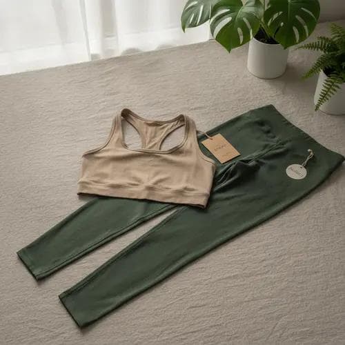
The strongest yoga apparel brands do not apply identity as an afterthought. They build it into the product itself. Silhouette, seam construction, fabric hand feel, waistband shape, strap design, hardware, stitching, and finishing can all become recognizable brand codes.
For example, a brand might use a signature curved back seam across its core leggings, a specific tonal logo treatment, and a recurring strap construction in its sports bras. Another may become known for minimalist seamless styles, muted coordinated colors, and matte trims. These repeated decisions help customers recognize products even when the logo is subtle.
Product identity should be documented with clear specifications. Useful standards include approved logo dimensions, placement measurements, label types, thread colors, trim finishes, zipper styles, drawcord details, packaging methods, and rules for coordinated sets. These details are especially valuable when working across multiple product categories or production seasons.
| Product touchpoint | Identity question to resolve | Production consideration ||---|---|---|| Fabric | Does the hand feel support the brand position? | Stretch, recovery, opacity, weight, finish || Silhouette | Is the fit recognizable and suitable for the target user? | Pattern blocks, grading, intended activity || Seam design | Can construction become a signature code? | Comfort, durability, visual shaping || Logo application | Is branding visible at the right level? | Technique, size, placement, wash resistance || Trims and hardware | Do details reinforce quality and personality? | Color matching, finish, minimum quantities || Labels | Is the brand hierarchy clear and compliant? | Material, dimensions, required information || Packaging | Does the unboxing experience match the product? | Protection, efficiency, customization, waste reduction |
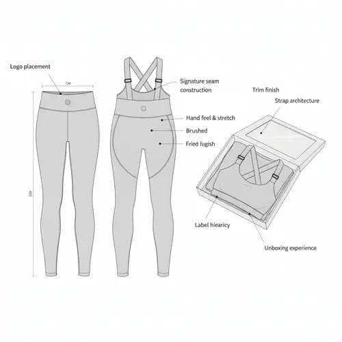
This integration is where OEM and ODM development can provide significant value. OEM production helps translate an established design and technical package into manufactured products, while ODM support can assist brands with product concepts, materials, construction options, and collection development. In both models, clear visual standards reduce inconsistency and improve decision-making during sampling.
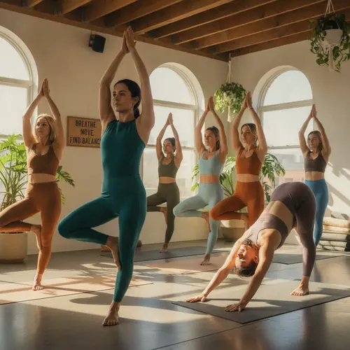
Photography is often the customer’s first direct experience of yoga apparel. It must communicate fit, fabric behavior, movement, styling, and brand emotion at the same time.
Create guidelines for lighting, backgrounds, locations, model selection, posing, movement, retouching, cropping, and color treatment. Decide how studio product photography should relate to lifestyle campaigns and how both should support the same brand personality.
A technical yoga wear brand may use crisp lighting, controlled compositions, and close-ups that demonstrate construction. A wellness-led label may prefer natural light, tactile environments, and relaxed movement. A fashion-oriented brand may use stronger styling, editorial framing, and distinctive locations.
Representation should also align with the intended customer community. Model casting, sizing, yoga experience, and movement direction all influence whether the imagery feels credible. The goal is to show the product clearly while creating a brand world customers want to join.
Packaging is part of the product experience, but it must also function efficiently. A cohesive system may include garment bags, size stickers, hangtags, tissue paper, mailers, boxes, inserts, and wholesale cartons. Each item should use a consistent hierarchy of logos, typography, colors, and product information.
For brands selling through retailers or distributors, the visual identity should also extend to line sheets, lookbooks, swatch cards, showroom displays, order forms, and sales presentations. These B2B materials influence how buyers assess the brand’s professionalism and commercial readiness.
Packaging decisions should be coordinated with production requirements. Custom dimensions, print colors, materials, finishing techniques, and order quantities can affect cost and lead time. Developing packaging alongside the garment collection helps ensure that product dimensions, folding methods, label locations, and shipment requirements are considered early.
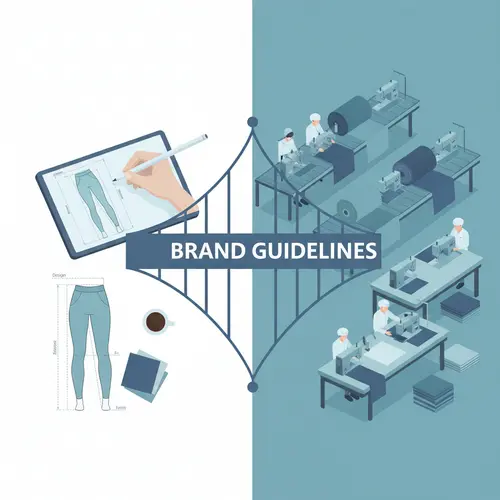
A visual identity system only works when people can apply it correctly. Brand guidelines should provide clear rules, practical examples, and production-ready specifications rather than abstract design language alone.
The document should cover logo formats and usage, color standards, typography, graphic elements, garment branding, photography direction, packaging, product presentation, and key digital applications. For yoga apparel production, it should also include technical examples such as logo placement diagrams, trim references, label hierarchies, approved branding techniques, and sample color combinations.
Avoid making the guidelines so rigid that they prevent growth. Separate fixed elements from flexible elements. The logo proportions and core color standards may remain fixed, while seasonal palettes, campaign layouts, and graphic applications may allow controlled variation.
A practical approval process is equally important. Identify who can approve product colors, print artwork, packaging proofs, garment samples, campaign images, and co-branded materials. Clear ownership prevents subjective changes from weakening the system over time.
Before launching the complete system, test it in realistic scenarios. Apply the identity to several core garments, a coordinated set, packaging, a product page, a campaign image, a hangtag, and a wholesale line sheet. Reviewing the system across these touchpoints will reveal gaps that may not appear in isolated design files.
Sampling is essential for product branding. Evaluate logo clarity, placement, scale, stretch performance, color matching, hand feel, and durability. Review the complete garment rather than the branding detail alone. A logo may be technically accurate but still feel too prominent, too subtle, or visually unbalanced once worn.
Brands should also consider how the identity performs at different levels of the customer journey. It needs to attract attention in a crowded marketplace, provide clarity during product evaluation, reinforce trust at purchase, and remain recognizable after repeated wear.
Growth introduces new product categories, designers, suppliers, markets, collaborations, and sales channels. Without governance, visual inconsistency can quickly appear.
Use a centralized library for approved logos, artwork files, color standards, packaging templates, product branding specifications, and photography examples. Establish version control so that teams and manufacturing partners work from current documents.
Conduct periodic identity reviews before major collection cycles. This does not mean redesigning the brand every season. Instead, assess whether new products and campaigns still express the original positioning, whether certain visual codes have become stronger, and whether any standards need refinement.
For international expansion, the system should also accommodate different label requirements, languages, retail formats, and customer preferences without losing its core identity. A flexible but well-governed system makes this adaptation easier.
One common mistake is following visual trends without connecting them to a clear brand strategy. Trend-driven colors, typefaces, and campaign styles may create short-term relevance but can weaken long-term recognition if they change too frequently.
Another mistake is designing the identity separately from the product. A beautiful brand presentation will not feel cohesive if the fabric, fit, trims, and logo applications communicate a different level of quality or personality.
Brands should also avoid over-branding. Large logos and repeated marks are not the only path to recognition. Consistent silhouettes, construction details, colors, materials, and styling can create a more sophisticated and ownable identity.
Finally, incomplete production specifications can lead to inconsistency. If suppliers receive only a logo file without clear instructions for size, placement, technique, color, and acceptable tolerances, results may vary between products and orders. Thorough documentation and physical sample approval are essential.
A cohesive visual identity system helps a yoga apparel brand look more professional, but its value goes beyond appearance. It creates a framework for product decisions, improves coordination among creative and production teams, and gives customers a consistent experience across every interaction.
The most effective systems connect strategy, design, and manufacturing. They translate the brand’s promise into fabrics, fits, colors, trims, labels, packaging, and imagery. When these elements work together, a yoga apparel brand becomes easier to recognize, easier to trust, and better prepared to expand into new collections and markets.
If you are developing a new yoga apparel brand or refining an existing collection, we can help translate your visual identity into production-ready products. Our B2B services support custom yoga wear development, OEM/ODM manufacturing, fabric and trim selection, logo and label applications, packaging customization, sampling, collection coordination, and long-term brand partnerships. Whether you have complete technical designs or need support developing a market-ready range, contact our team to discuss your positioning, product requirements, target quantities, and launch plan. Together, we can build yoga apparel that expresses your brand consistently from the first sample to the finished collection.
A complete system should include brand positioning, logo variations, color standards, typography, graphic elements, photography direction, garment branding rules, labels, trims, packaging, and practical application guidelines. For custom yoga apparel, it should also define logo techniques, placement measurements, color approval methods, and product-level specifications.
Keep the core identity stable while allowing controlled seasonal variation. Primary logo rules, core typography, signature product details, and key brand colors can remain consistent, while seasonal colors, prints, campaign concepts, and selected silhouettes evolve within an established framework.
Visual identity should be shared at the beginning of product development. Early communication allows the manufacturer to consider fabric suitability, logo reproduction, color matching, label construction, trim customization, packaging, minimum order requirements, and sample lead times before designs are finalized.
OEM generally focuses on manufacturing products based on the brand’s designs, technical specifications, and branding requirements. ODM may provide broader product development support, including design concepts, fabric recommendations, construction options, and collection planning. The appropriate model depends on the brand’s internal design capabilities and the level of development assistance required.
Focus on disciplined choices rather than adding more elements. A refined color palette, consistent typography, carefully selected fabrics, precise fit, subtle logo placement, coordinated trims, and well-designed packaging can create a premium impression. Consistency in execution is usually more effective than excessive decoration.
Written by
Dayu
Ready to bring your
yoga brand to life?